In a marketplace where consumers scroll past hundreds of products daily, the brands that stop thumbs and open wallets share one thing in common: an unmistakable visual identity. For direct-to-consumer companies, where there is no retail shelf to rely on and no sales associate to explain the value proposition, your visual identity is your first and often only salesperson.
D2C branding is not a logo slapped on packaging. It is a system of visual cues -- colour, typography, imagery, spatial rhythm -- that tells a story before a single word is read. Get it right, and you build recognition, trust, and a price premium that compounds over time. Get it wrong, and you fade into the sea of generic products competing on price alone.
The Economics of Visual Identity for D2C Brands
When a D2C brand invests in visual identity, the returns show up in places most founders do not expect. Research from Lucidpress found that consistent brand presentation across all platforms can increase revenue by up to 23 percent. For D2C companies spending heavily on paid acquisition, that lift can mean the difference between profitable growth and an unsustainable burn rate.
Consider the unit economics. A strong visual identity:
- Increases ad click-through rates because distinctive creative stands out in crowded social feeds
- Reduces bounce rates on landing pages because visual consistency builds immediate trust
- Lifts average order value because perceived quality correlates directly with design quality
- Drives organic sharing because people share products that look good in their stories and feeds
- Lowers customer acquisition cost over time as brand recognition compounds
Warby Parker understood this from day one. Their clean, approachable aesthetic -- muted colours, friendly serif typography, lifestyle photography with natural light -- did not just look good. It communicated affordability without cheapness, intelligence without pretension. That visual system became as recognisable as any logo, and it translated seamlessly from Instagram to packaging to retail spaces.
What Makes a Visual Identity System (Not Just a Logo)
Many D2C founders make the mistake of treating visual identity as a one-time deliverable: hire a designer, get a logo, move on. But a logo is only the anchor point of a much larger system. A complete visual identity for D2C includes several interconnected elements.
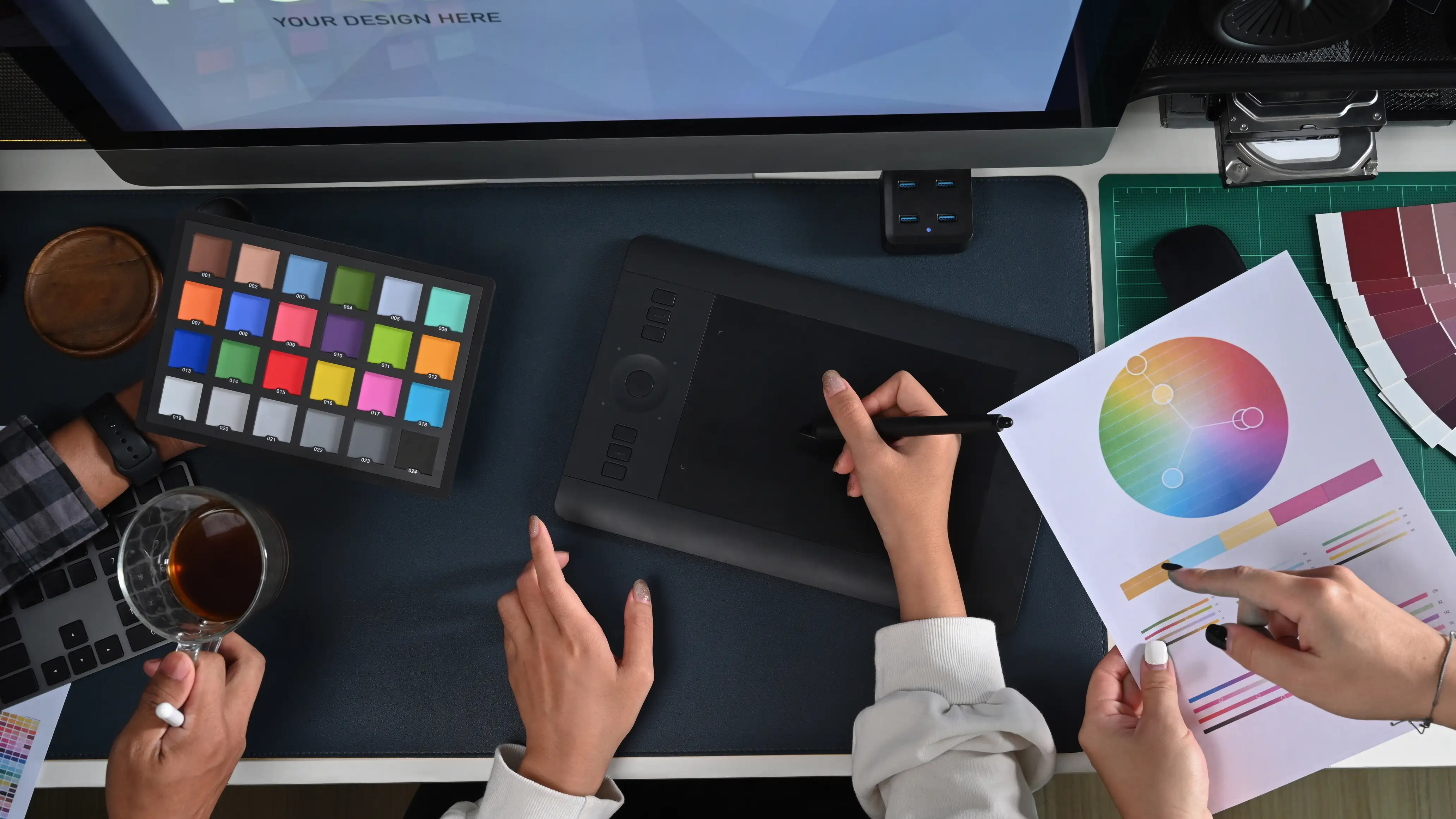
Colour Strategy
Your palette needs to work across digital screens, packaging, and photography. It should include a primary brand colour, two to three supporting colours, and neutral tones for backgrounds and text. The palette must be tested on both light and dark backgrounds, and it must meet accessibility contrast ratios for web use.
Typography System
Choose a heading typeface and a body typeface that complement each other. The heading font carries brand personality, while the body font prioritises readability. D2C brands also need to consider web font loading performance -- a beautifully chosen typeface that slows your site by two seconds will cost you conversions.
Photography and Imagery Direction
This is where many D2C brands fail. They invest in a strong logo and colour palette, then use generic stock photography that undermines everything. Your imagery guidelines should define lighting style, colour grading, composition rules, and model casting direction. Allbirds, for instance, built an entire visual language around natural textures and overhead flat-lay compositions that made their shoes feel like objects of nature rather than manufactured goods.
Spatial and Layout Principles
How elements are arranged on a page communicates as much as the elements themselves. Generous whitespace signals premium. Dense layouts signal value. Your visual identity should define spacing ratios, grid systems, and component patterns that remain consistent whether someone encounters your brand on a mobile ad, your homepage, or an unboxing video.
How Visual Identity Drives Customer Lifetime Value
The real power of d2c branding reveals itself not in the first purchase but in every interaction that follows. When a customer opens a package and the unboxing experience matches the aesthetic of the ad that attracted them, which matches the website where they purchased, which matches the email they receive three days later -- that consistency builds a neurological shortcut. The brain starts associating your visual patterns with positive experiences, and that association becomes increasingly difficult for competitors to displace.
This is why the most successful D2C brands obsess over touchpoint consistency:
- Pre-purchase: Social ads, influencer content, landing pages, and retargeting all use the same visual language
- Purchase: Product pages, cart design, checkout flow, and order confirmation maintain visual continuity
- Post-purchase: Packaging, inserts, follow-up emails, and review requests extend the same identity
- Re-engagement: Loyalty programmes, seasonal campaigns, and new product launches build on established visual equity
Each touchpoint that breaks from the visual system creates cognitive friction. Each one that reinforces it deepens the relationship.
Common Visual Identity Mistakes D2C Brands Make
After working with D2C brands across categories, certain patterns emerge among those who struggle to establish visual distinctiveness.
- Following trends too closely: Minimalist sans-serif logos, pastel colours, and clean-line illustrations have become so prevalent among D2C brands that they now signal sameness rather than modernity. Your visual identity needs a point of differentiation.
- Designing for one channel only: A visual identity built exclusively for Instagram may fall apart on a product detail page or physical packaging. Design the system, then adapt it per channel.
- Ignoring scalability: Your visual identity needs to work at favicon size and billboard size. If your logo loses legibility at small sizes or your colour palette does not reduce well to one or two colours, you have a scalability problem.
- Skipping brand guidelines: Without documented guidelines, every new designer, agency, or contractor introduces drift. Within a year, you have five slightly different versions of your brand across channels.
- Treating packaging as an afterthought: For D2C brands, packaging is a primary brand touchpoint. It deserves the same strategic thinking as your website.
Building Your Visual Identity: A Practical Framework
If you are a D2C brand ready to invest in visual identity, here is a structured approach that balances strategic depth with practical execution.
Phase 1: Strategic Foundation
Before any design work begins, define your brand positioning. Who are you for? What do you stand against? What emotional territory do you own? These answers inform every visual decision that follows. A professional branding team can facilitate this process and ensure your positioning is differentiated within your category.
Phase 2: Visual Exploration
With positioning locked, explore multiple visual directions. Each direction should include colour, type, imagery, and layout explorations presented together -- not as isolated elements. Evaluate each direction against your positioning and your competitive landscape.
Phase 3: System Development
Once a direction is selected, develop it into a full system. Create comprehensive brand guidelines covering every element discussed above. Test the system across real touchpoints: mock up a product page, a social ad, a shipping box, an email. If it does not hold up across all of them, iterate.
Phase 4: Implementation and Governance
Roll out the system across all channels with clear documentation. Establish a review process for new creative to catch drift early. For D2C brands scaling quickly, this governance step is often the one that separates brands that maintain their identity from those that lose it.
The Competitive Advantage That Compounds
In D2C, where barriers to entry are low and competition is fierce, visual identity is one of the few sustainable competitive advantages. Products can be copied. Pricing can be undercut. Distribution can be replicated. But a deeply embedded visual identity that lives in your customers' minds -- that takes years to build and is nearly impossible to duplicate.
The D2C brands that will dominate the next decade are those investing in visual identity today -- not as a cost centre, but as a strategic asset that reduces acquisition costs, increases lifetime value, and builds the kind of brand equity that makes a company worth more than the sum of its products.
If your brand is ready to move beyond a logo and build a visual identity system that drives measurable business results, Ardena's branding services team works with D2C and consumer brands to create identities that convert. Reach out to start the conversation.