Pioneering
Creative
Excellence
ardenatech.com
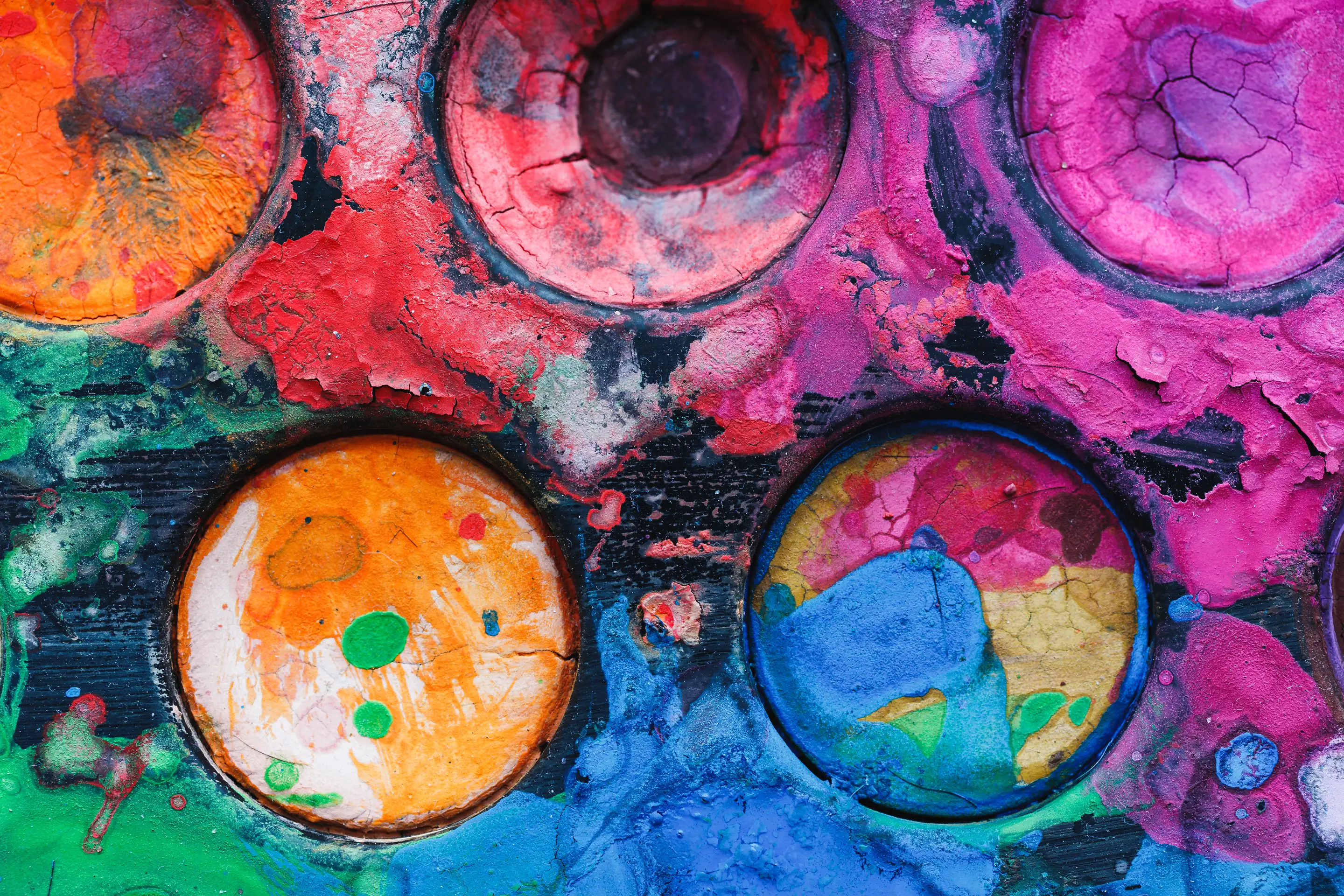
The Science of Sight: Why Ardena Orange Dictates Action
Colour is not decoration -- it is strategy. Using Ardena's own brand colours as a case study, we explore the psychology of orange and how colour drives conversion.

When we built Ardena's visual identity, the colour choice was not made in a brainstorming session with sticky notes and mood boards. It was made with intention rooted in colour psychology, competitive analysis, and a clear understanding of what we wanted people to feel the moment they encountered our brand. The result was orange -- not just any orange, but a specific, warm, energetic hue that communicates exactly what we want our brand to say before a single word is read.
This is not an article about why we like the colour orange. It is a case study in how colour psychology informs brand design decisions that drive measurable business outcomes. Every colour choice your brand makes is either working for you or against you, and most organisations have never examined which one it is.
Colour Is Not Aesthetic. Colour Is Strategy.
The human brain processes colour 60,000 times faster than text. Before a visitor reads your headline, comprehends your value proposition, or evaluates your credibility, they have already formed an impression based on your colour palette. That impression is not random. It is shaped by decades of psychological research into how specific wavelengths of light trigger emotional and behavioural responses.
Colour psychology is not pseudoscience or marketing folklore. It is grounded in peer-reviewed research spanning neuroscience, behavioural economics, and environmental psychology. A study published in the journal Management Decision found that up to 90 percent of snap judgements about products are based on colour alone. Research from the University of Winnipeg confirmed that colour increases brand recognition by up to 80 percent.
For brand design, these findings translate into a clear principle: your colour palette is not a design decision. It is a strategic decision with direct commercial implications. Choosing colours because they "look nice" is like choosing a business name because it "sounds good" -- it might work, but you are leaving the outcome to chance when you could be engineering it.
Why Orange: The Psychology of Action
Every colour occupies a specific territory in the human psychological landscape. Blue signals trust and stability, which is why financial institutions and technology companies gravitate toward it. Green communicates growth and natural harmony. Red triggers urgency and excitement. Each association is not arbitrary -- it is the product of evolutionary wiring and cultural reinforcement working in concert.
Orange sits at a unique intersection. It carries the energy and urgency of red without the aggression. It borrows the warmth and optimism of yellow without the anxiety that pure yellow can provoke at high saturation. Orange is the colour of action, enthusiasm, and creative confidence. It is the colour of sunrise and harvest, of warmth and momentum.
In the context of visual identity for a digital marketing agency, orange communicates precisely the right message:
- Energy and momentum: We move fast and drive results. Orange is not a passive colour. It does not sit quietly in the background. It demands attention and implies forward motion.
- Warmth and approachability: Despite our technical expertise, we are not cold or intimidating. Orange is inherently friendly -- it is the colour of social gatherings, of hearth fires, of autumn abundance. It signals that working with us will be a human experience, not a clinical one.
- Creative confidence: Orange is the colour most associated with creativity and innovation in psychological studies. For an agency that solves problems through creative strategy, this association reinforces our positioning at a subconscious level.
- Urgency without alarm: Red says "emergency." Orange says "opportunity." For a brand that helps businesses grow, we want to inspire action without provoking anxiety. Orange strikes this balance precisely.
The Competitive Dimension of Colour Choice
Colour psychology does not operate in isolation. It operates within a competitive context. The right colour for your brand is not simply the one with the most favourable psychological associations -- it is the one that creates maximum distinctiveness within your competitive landscape.
When we analysed the digital marketing agency space before finalising our visual identity, the pattern was overwhelming. Blue dominated. Agency after agency had chosen some variation of blue, navy, or teal, presumably drawn by its associations with trust and professionalism. The second most common choice was black and white minimalism, signalling sophistication. Green, purple, and red appeared occasionally.
Orange was conspicuously absent. And that absence was an opportunity.
In a sea of blue agencies, an orange brand does not just stand out -- it becomes impossible to confuse with competitors. When a potential client visits five agency websites in a single research session, the blue ones blur together. The orange one is remembered. This is not speculation. Research on the Von Restorff effect -- also known as the isolation effect -- demonstrates that items that differ from their surroundings are significantly more likely to be recalled.
Brand design that ignores competitive context is brand design that fails at its primary job: differentiation. Your colour palette must work within your category to create separation, not conformity.
How Colour Drives Conversion
The commercial impact of colour extends well beyond brand recognition. Colour directly influences user behaviour on digital properties, and the data is unambiguous.
Call-to-Action Performance
A/B testing data consistently shows that CTA buttons in warm colours -- orange, red, and yellow-orange -- outperform cool-coloured alternatives. HubSpot's widely cited test found that a red CTA button outperformed a green one by 21 percent. Our own testing with client campaigns has shown orange CTAs delivering 15 to 28 percent higher click-through rates compared to blue or grey alternatives, depending on the surrounding design context.
The reason is rooted in visual salience. Orange buttons create strong contrast against the blue and white backgrounds that dominate web design, drawing the eye and prompting action. But it goes deeper than contrast. Orange buttons feel inviting rather than aggressive, reducing the psychological friction associated with clicking. Users are not just seeing the button -- they are feeling encouraged by it.
Emotional Priming and Purchase Decisions
Colour primes emotional states that influence downstream behaviour. When a user arrives on a website dominated by warm, energetic colours, they enter a psychological state characterised by higher activation and more positive affect. This state correlates with faster decision-making and higher conversion rates.
A study in the Journal of Business Research found that warm colour environments increased impulsive purchasing behaviour by 18 percent compared to cool colour environments. For e-commerce and service businesses, this means your colour palette is directly influencing whether visitors convert or deliberate themselves into inaction.
Trust Calibration Through Colour Consistency
Colour consistency across touchpoints does more than reinforce recognition. It builds trust through a psychological mechanism called the "mere exposure effect" -- the tendency for people to develop preferences for things they encounter repeatedly. When your brand's colour palette appears consistently across your website, social media, email communications, and physical materials, each exposure deepens the audience's comfort and trust.
This is why colour governance is as important as colour selection. A branding services partner that helps you choose the right palette but does not help you implement it consistently has done only half the job.

Building Your Own Colour Strategy: A Framework
Whether your brand is established and reconsidering its palette or new and making these decisions for the first time, colour selection deserves a structured, evidence-based approach. Here is the framework we use at Ardena, applied to our own brand and to every client engagement.
Step 1: Define Your Brand Attributes
Before selecting a single colour, articulate the three to five attributes your brand must communicate. Not aspirational qualities -- operational ones. What do clients actually experience when working with you? For Ardena, those attributes were energy, creativity, warmth, expertise, and boldness. Each attribute narrowed the colour field.
Step 2: Map the Competitive Landscape
Catalogue the colour palettes of your fifteen to twenty closest competitors. Identify clusters and gaps. The clusters tell you what your industry defaults to. The gaps tell you where differentiation is possible. A visual identity built on differentiation outperforms one built on conformity every time.
Step 3: Cross-Reference Psychology and Positioning
With your attributes defined and competitive landscape mapped, identify the colours that align with your attributes and occupy a gap in your competitive space. If multiple colours qualify, prioritise the one with the strongest alignment to your primary attribute.
Step 4: Test Across Applications
Before committing, mock up your shortlisted colours across real applications: website headers, social media posts, email templates, business cards, presentation decks. A colour that works beautifully in a logo can become fatiguing at scale, or it can prove difficult to pair with photography. Testing reveals these issues before they become expensive problems.
Step 5: Build the Full System
Your primary colour is the anchor, but it needs supporting colours to create a functional system. Define secondary and accent colours, neutral tones, and rules for colour proportions. Document everything in brand guidelines that any designer or developer can follow without ambiguity.
Colour as Competitive Advantage
Most brands treat colour as a cosmetic decision made early and revisited never. The organisations that understand colour psychology and visual identity as strategic levers gain an advantage that compounds over time. Every ad, every landing page, every email, every social post reinforces the psychological associations their palette was designed to create.
At Ardena, our orange is not just a colour. It is a strategic asset that communicates energy, warmth, and creative confidence before we say a word. It differentiates us in a competitive landscape dominated by safer choices. And it drives measurable performance through higher engagement, stronger recall, and improved conversion rates across every channel.
Your brand's colours are doing something, whether you designed them to or not. The question is whether they are doing what you need them to do.
If your brand is ready for a colour strategy grounded in psychology and built for performance, Ardena's branding services team brings both the creative vision and the strategic rigour to get it right. Contact us to explore what your visual identity could be.